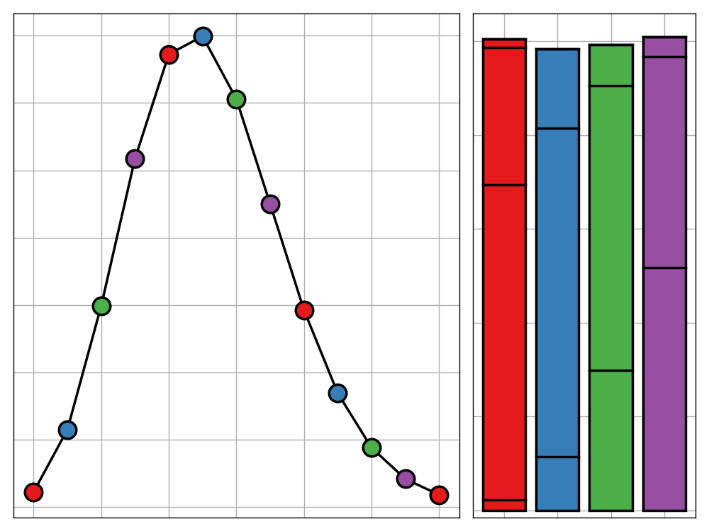

Bank Holiday Bodge: A Wall of Music
Sometimes, perfection overkill. In this spirit I would like to introduce a series of new blog posts - each installment of which being written and released on a UK bank holiday - in which I plan, build, and discuss a data science project all within the span of one day. In this maiden post, I use technqiues in dimensionality reduction and web-scrapping to produce a 'Wall of Music' based off the 2017/18 Spotify top 100 tracks.

The Inaccuracy of Accuracy
In a data-driven world, your analyses will only ever be as good as the metric you use to evaluate them. In this post, I make the claim that the de facto metric used in data science is unfit for purpose and and can lead to the construction of unethical models. If this is the case, what should we use instead?
Letter Distributions in the English Language and Their Relations
If you've ever tried to solve a simple cryptography problem, then you may have developed an intuitive sense of where you're most likely to find a letter in a word. For example, 'Q's are rarely at the ends of words whereas 'D's are much more likely to be found there. This post explores this idea and concludes by clustering the letters of the Latin alphabet based on their distributions throughout English words.

Streamlining Your Data Science Workflow With Magrittr
The Tidyverse is here to stay so why not make the most out of it? The `magrittr` package extends the basic piping vocabulary of the core Tidyverse to facilitate the production of more intuitive, readable, and simplistic code. This post aims to be an all encompassing guide to the package and the benefits it provides.
Gloopy Violin Plots
The fourth dimension is often overlooked in data visualisation applications but, in doing so, are we potentially missing out on some more effective ways to present data? In this post, I argue that there are certain use cases where adding a temporal dimension to your visualation greatly improves the clarity of the result in expressing you message. Furthermore, I offer an example of such a visualisation, produced using the `gganimate` package.

Efficiently Removing Zero Variance Columns (An Introduction to Benchmarking)
There are many machine learning algorithms, such as principal component analysis, that will refuse to run when faced with columns of data that have zero variance. There are multiple ways to remove these in R, some much faster than others. In this post, I introduce some such methods and demonstrate how to use the `rbenchmark` package to evaluate their performance.
Recent