Bank Holiday Bodge: Parametric Snowflakes
After yesterday's post drawing Christmas trees with Python, it's time to give R a chance to shine. In this post, I use the shiny and ggvis packages to build a webapp for generating parametric snowflakes.
Bank Holiday Bodge: Coding up Christmas
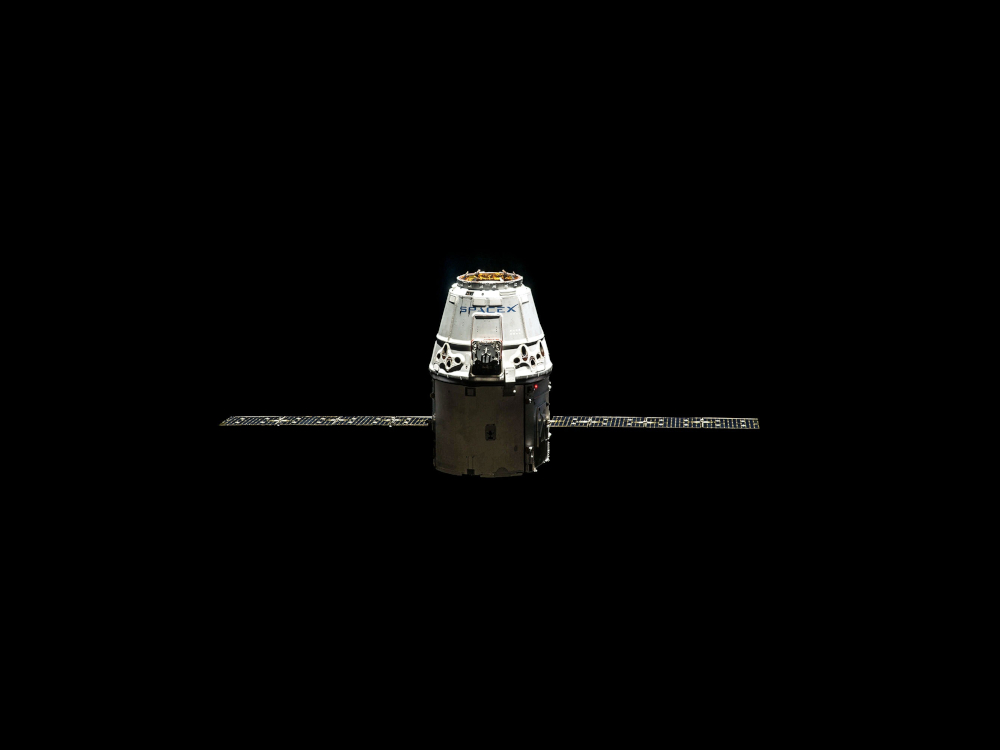
Christmas is here but that's no excuse to stop coding. In the second installment of the bank holiday bodge series, there will be a major change in format but the principle will stay the same—showcasing a rough piece of work brought to fruition in a single day. This post will concern the use of parametric equations and the animation module from matplotlib to generate your own ornamented Christmas tree animation
Yet Another Sorting Algorithm Visualisation
Sorting algorithms are an essential part of a computer scientist's toolbox. They are so integral to the field that there are almost endless visualisations of the algorithms at work. I've decide to jump on the band wagon and make my own contribution. In this post I discuss my visualisation method and showcase its application on a few simple sorting algorithms, explaining how such processes work in the meantime.
A Statistican's Guide to Playing Darts
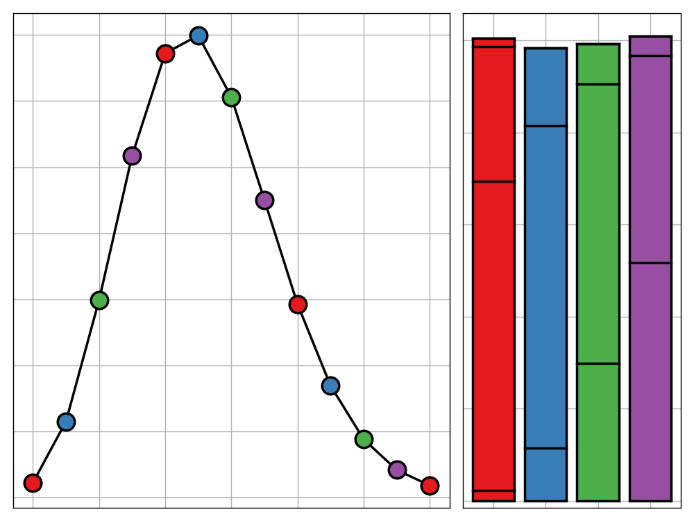
Although the game of darts requires a tremendous amount of skill to be a good player, there is still a very large probabilistic element. In this post, we take undertake a stochastic analysis of the game in order to reach an optimum strategy for play depending on the typical accuarcy of your shots.
Gloopy Violin Plots
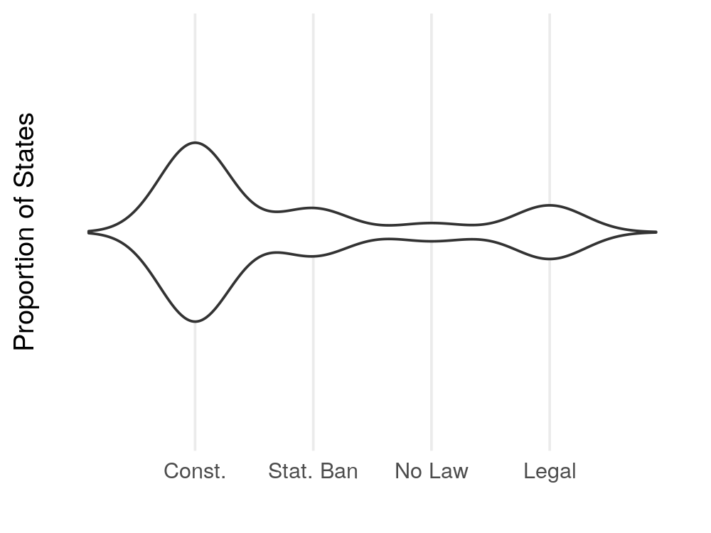
The fourth dimension is often overlooked in data visualisation applications but, in doing so, are we potentially missing out on some more effective ways to present data? In this post, I argue that there are certain use cases where adding a temporal dimension to your visualation greatly improves the clarity of the result in expressing you message. Furthermore, I offer an example of such a visualisation, produced using the `gganimate` package.


